Textfield
Textfield は、 UI にテキストを入力したいときに使うコンポーネントです。線で囲む、または領域を塗りつぶした見た目にすることで、テキストを入力する範囲を明確にユーザーに伝えます。また、Label や Helper Text、適切なエラーメッセージを提供することで、テキストの入力をサポートします。
1. 概要 (Overview)
説明
Textfield は Container、Label、Helper Text を組み合わせて構成されます。
- Container: 実際に文字を入力できる領域。先頭と末尾には入力を補助する Button・Icon・Text を挿入できます。
- Label: 入力すべき内容を簡潔に伝えるテキスト。コンテキストがひと目で分かる場合(検索など)を除き省略できません。切り捨てや複数行への折り返しはできません。
- Helper Text: ヒント、エラーメッセージ、文字数カウンターなどの補助的なテキスト。
Inhouse の Textfield は、1行のテキスト入力(<input>)と改行を伴う複数行のテキスト入力(<textarea>)の両方に共通のスタイルを提供します。読み取り専用にする場合は、Helper Text 部分に「読み取り専用」と記載します。
リンク
2. 構成要素 (Anatomy)
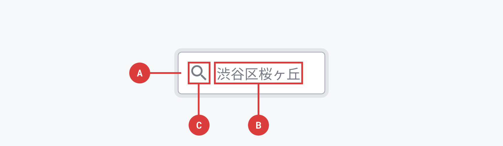
AContainer
テキストフィールドのかたちをつくる要素です。この要素の大きさが、テキストフィールドをタップ/クリックできる範囲です。
必須/任意: 必須
BInput text / Placeholder text
Input textは、ユーザーがテキストフィールドに入力したテキストです。Input textの内容が空の場合は表示しないか、HTMLのinput要素のplaceholder属性に指定したテキストを表示し、これをPlaceholder textと呼びます。Input textとPlaceholder textは同じ要素ですが、状態によって名前が変わります。
Placeholder textを表示する場合は、Input textと区別するために、配色の明度を下げます。Placeholder text には記入例を入れます。Placeholder text を Label の代わりにすることはできません(ユーザーの短期記憶に負荷がかかるため、また自動入力済みのテキストと誤認される可能性があるため)。
必須/任意: 任意(内容が空の場合もある)
CLeading icon
テキストフィールドのアイコンです。テキストフィールドが提供している機能の意味を伝わりやすくするために、情報を補完する機能を持ちます。Input text / Placeholder textの左のみに配置し、右には配置しません。
必須/任意: 任意
Container 内の補助要素
Container の先頭と末尾には、入力を補助する要素を挿入できます。
- Button: マイクアイコンの Button で入力方法を拡張、フィールドのクリアなどの追加機能を提供する用途で使います。
- Icon: 検索クエリを入力する Textfield であることを虫眼鏡アイコンで示すなどの用途で使います。色覚特性に配慮して、有効・エラー状態をアイコンで明確にすることにも使えます。
- Text: 通貨単位、ドメイン、上限値など、入力を補助する情報を表示する用途で使います。
Label
Container の外側に配置し、入力すべき内容を簡潔に伝えるテキストです。コンテキストがひと目で分かる場合(検索など)を除き、原則として省略できません。可読性を確保するため、切り捨てや複数行への折り返しもできません。
Label を Container 内に配置し、Focus 時に上部へアニメーションさせるフローティング Label パターンは、placeholder や初期値・自動入力済みテキストと認識されるおそれがあるため、Inhouse では推奨しません(実装も提供していません)。
Helper Text
Container の周辺に配置する補助的なテキストです。用途別に置く位置が異なります。
- ヒント: 入力フィールドの使用方法など追加のガイダンスを伝える用途。Label の直下に配置し永続的に表示します(Container の下に置くと有効・エラーメッセージとぶつかって消えてしまうため)。
- 有効・エラーメッセージ: 入力が受け入れられない/受け入れられた場合のメッセージ。Container の下に表示します。エラーは入力を修正する方法を伝えます。
- 文字数カウンター: 文字数制限がある場合に、入力されている文字数と上限文字数を表示します。
3. 使い分け (Usage)
いつ使うか
UI にテキストを自由入力させる必要がある場面で使います。Inhouse の Textfield は、1行入力と複数行入力の両方をカバーしているため、入力させたいテキストの性質に応じて HTML のマークアップを使い分けます。
<input>でマークアップする: メールアドレスや氏名、検索キーワードなど、改行を含まない1行のテキストを入力させる場合に使います。<textarea>でマークアップする: コメントや問い合わせ本文など、改行を伴う長文を入力させる場合に使います。<textarea>はオーバーフローしたテキストを次の行に折り返し、垂直方向にスクロールできます。
いつ使わないか
- テキストを自由入力するのではなく、複数の選択肢から一つを選択する場合は Select を使います。
類似コンポーネントとの違い
- Select: 定義された選択肢から一つを選ばせたい場合に使います。Textfield は値を自由入力させたい場合に使います。
4. バリエーション (Variants)
Appearance
Textfieldの見た目を指定できます。
| Modifier class | ||
|---|---|---|
| Outlined* | .-appearance-outlined | |
| Filled | .-appearance-filled |
推奨される選び方の判断基準:
- どちらの Appearance も同じ機能を提供します。サービスのスタイルに最適なものを選択してください。
- 同一の画面内で使用する場合は、同じセクション内で異なる Appearance を混在させず、セクション内では一貫した Appearance を使います。
Color
Semantic Colorを指定して配色できます。
| Modifier class | Pepper flavor | |
|---|---|---|
| Neutral* | .-color-neutral | Pepper Gray |
| Negative | .-color-negative | Pepper Red |
推奨される選び方の判断基準:
- Neutral: 通常の状態。
- Negative: 入力したテキストが無効な状態、エラーを表します。
なお、ガイドライン上は Positive(入力したテキストが有効な状態)、Notice(無効やエラーではないが注意がある状態)も定義されていますが、Inhouse Components Web では現状 Neutral / Negative の2種類を提供しています。
Size
どのくらいの大きさで表示するか指定できます。
| Modifier class | ||
|---|---|---|
| S | .-size-s | |
| M* | .-size-m | |
| L | .-size-l |
推奨される選び方の判断基準:
- 基本のサイズは M。
なお、ガイドライン上は XS / S / M / L / XL の5種類のサイズが定義されていますが、Inhouse Components Web では現状 S / M / L の3種類を提供しています。
Width
親要素の幅に対してどのくらいの幅で表示するか指定できます。
| Modifier class | ||
|---|---|---|
| Auto* | .-width-auto | |
| Full | .-width-full | |
| Half | .-width-half | |
| Third | .-width-third |
推奨される選び方の判断基準:
- ラベルの文字量や配置領域に応じて選びます。
- Auto: 内容に応じた幅で表示する。
- Full: 親要素の幅いっぱいに広げる。
- Half / Third: 親要素に対して 1/2、1/3 の幅で表示する。
なお、ガイドライン上は Full / Half / Third の3種類で、Auto は Inhouse Components Web で独自に追加しています。
実装
Mixin-based
HTML
<div class="textfield-component">
  <input class="_input" type="text" value="" placeholder="渋谷区桜丘町" />
</div>
SCSS
@use '@pepabo-inhouse/components-web' as inhouse;

.textfield-component {
  @include inhouse.textfield-style(
    $options: (
      appearance: outlined,
      color: neutral,
      size: m,
      width: auto,
    )
  );
}
Class-based
HTML
<div class="in-textfield -appearance-outlined -color-neutral -size-m -width-auto">
  <input class="_input" type="text" value="" placeholder="渋谷区桜丘町" />
</div>
SCSS
@use '@pepabo-inhouse/components-web' as inhouse;

@include inhouse.textfield-export;
5. ステート (States)
Default
特に何もアクションしていないデフォルトの状態です。
Hover
線に Hover の Overlay Color を重ねて、選択しようとしていることを示します。
Focus
線に Focus の Overlay Color を重ねてフォーカスされていることを示し、Focus Ring をつけてフォーカスされていることを強調します。
Disabled
透明度を上げて、インタラクションが不可能であることを示します。
Error
.-color-negative モディファイアを適用し、入力したテキストが無効な状態を表します。エラー時はあわせて Helper Text 部分でエラー内容と修正方法を伝えます。
6. アクセシビリティ (Accessibility)
このコンポーネント固有のチェック項目です。コントラスト・フォーカス可視化など全コンポーネント共通の原則はアクセシビリティガイドラインを参照してください。
<label>要素で Label をマークアップし、for属性(または親子関係)で<input>と関連付ける- Placeholder text を Label の代わりに使わない(コンテキストがひと目で分かる場合を除き Label は省略しない)
- 入力に関するヒントは Helper Text として配置し、
aria-describedbyで<input>と関連付ける - エラー時は
<input>にaria-invalid="true"を設定し、Helper Text にエラー内容と修正方法を記載する
7. ライティング (Writing)
- Label は入力すべき内容を簡潔に伝える。コンテキストがひと目で分かる場合(検索など)を除き省略しない
- Label は切り捨てや複数行への折り返しをせず、短く・明確で・完全に見えるようにする
- Placeholder text には記入例を入れる。Label の代わりにしない(ユーザーの短期記憶に負荷がかかり、自動入力済みのテキストと誤認されるおそれがあるため)
- ヒント(Helper Text)は入力フィールドの使用方法など追加のガイダンスを簡潔に伝える
- エラーメッセージは何が問題かを示すだけでなく、入力をどう修正すれば良いかの具体的な指示を含める