Sizing
Inhouseでは、要素どうしの間隔やボタンの高さ、角丸の半径など、あらゆるサイズはタイポグラフィを根拠にして決めています。具体的には、ブラウザの文字サイズの100%に相当する16pxと、文字サイズの150%に相当する24pxを行の高さの基準として、16pxまたは24pxの倍数のバリエーションの中から選んでサイズを決めることで、ページの縦方向のリズム(バーティカルリズム)を揃えています。
このドキュメントでは、サイズのバリエーションの一覧であるSizing scaleと、そのSizing scaleから用途別に最適な値を選んで名前をつけたSemantic tokenを紹介しています。すべての値は、単位をRemにした数値で返ってくるように設計されたSass functionから取得できます。
*このページで表記しているPixelは1remが16pxの場合の値です
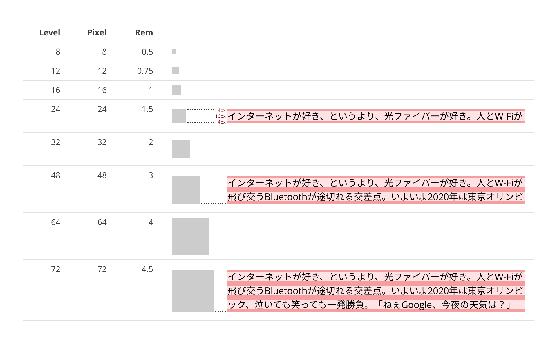
Sizing scale
Sass function
Sizing scaleのサイズを取得できます。
Syntax
get-sizing-scale-size($level)
Usage
@use '@inhouse/inhouse-components-web' as inhouse;

.example {
  height: inhouse.get-sizing-scale-size($level: 16);
}
| Level | Pixel(Pepper flavor) | Rem(Pepper flavor) |
|---|---|---|
| 1 | 1 | 0.0625 |
| 2 | 2 | 0.125 |
| 4 | 4 | 0.25 |
| 8 | 8 | 0.5 |
| 12 | 12 | 0.75 |
| 16 | 16 | 1 |
| 20 | 20 | 1.25 |
| 24 | 24 | 1.5 |
| 32 | 32 | 2 |
| 40 | 40 | 2.5 |
| 48 | 48 | 3 |
| 56 | 56 | 3.5 |
| 64 | 64 | 4 |
| 72 | 72 | 4.5 |
| 80 | 80 | 5 |
| 96 | 96 | 6 |
| 112 | 112 | 7 |
| 120 | 120 | 7.5 |
| 128 | 128 | 8 |
| 144 | 144 | 9 |
| 160 | 160 | 10 |
| 168 | 168 | 10.5 |
| 176 | 176 | 11 |
| 192 | 192 | 12 |
| 216 | 216 | 13.5 |
| 240 | 240 | 15 |
| 264 | 264 | 16.5 |
| 288 | 288 | 18 |
| 312 | 312 | 19.5 |
*必要以上の選択肢を減らすためにLevel 192以降は24pxの倍数に絞っています
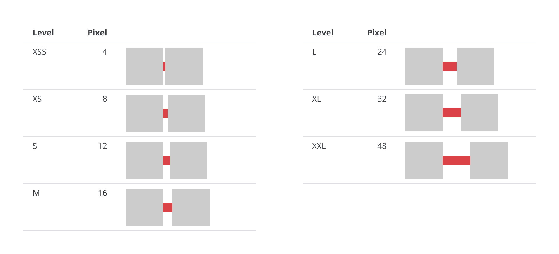
Spacing
Sizing scaleから、要素どうしの間隔を決めるのに最適な値を選び、SpacingとしてLevel XXSからXXLまで名前をつけています。
Sass function
Spacingのサイズを取得できます。
Syntax
get-spacing-size($level)
Usage
@use '@inhouse/inhouse-components-web' as inhouse;

.example {
  margin-top: inhouse.get-spacing-size($level: m);
}
| Level | Pixel(Pepper flavor) | Rem(Pepper flavor) |
|---|---|---|
| xxs | 4 | 0.25 |
| xs | 8 | 0.5 |
| s | 12 | 0.75 |
| m | 16 | 1 |
| l | 24 | 1.5 |
| xl | 32 | 2 |
| xxl | 48 | 3 |
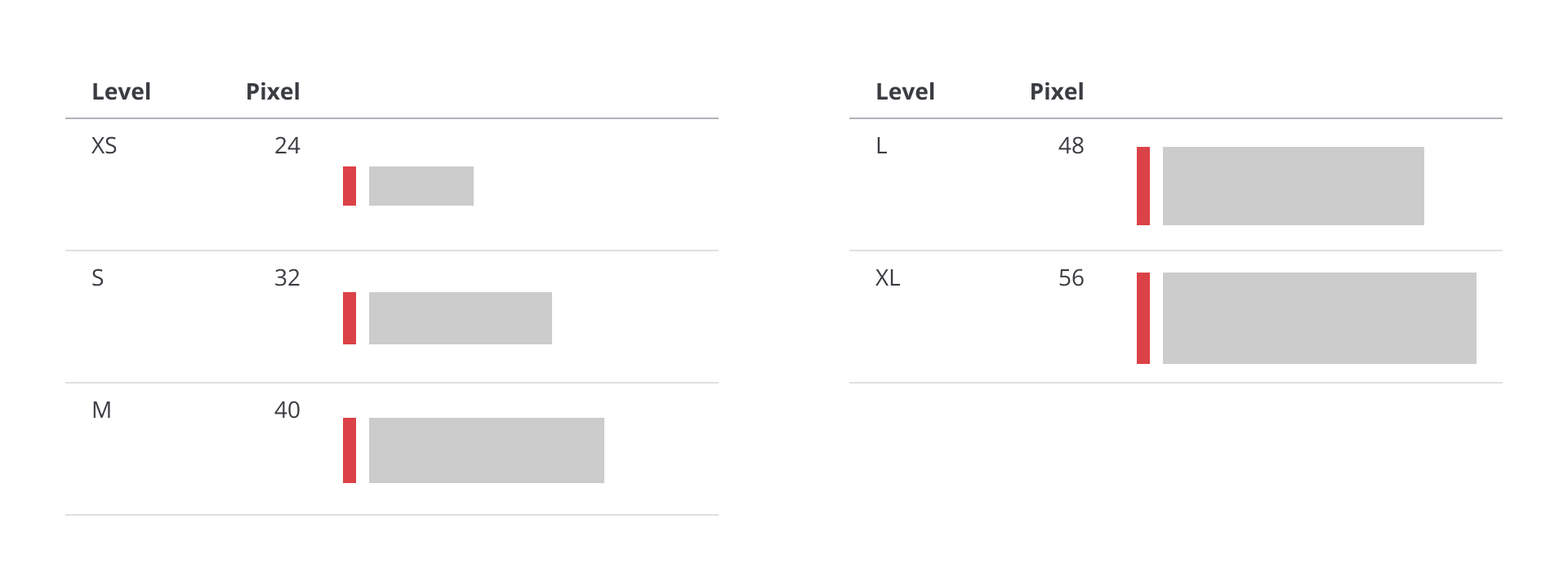
Interactive component
Sizing scaleから、ボタンなどユーザーがタップやクリックできる要素の高さを決めるのに最適な値を選び、Interactive componentとしてLevel XSからXLまで名前をつけています。
Sass function
Interactive componentのサイズを取得できます。
Syntax
get-interactive-component-height($level)
Usage
@use '@inhouse/inhouse-components-web' as inhouse;

.example {
  height: inhouse.get-interactive-component-height($level: m);
}
| Level | Pixel(Pepper flavor) | Rem(Pepper flavor) |
|---|---|---|
| xs | 24 | 1.5 |
| s | 32 | 2 |
| m | 40 | 2.5 |
| l | 48 | 3 |
| xl | 56 | 3.5 |
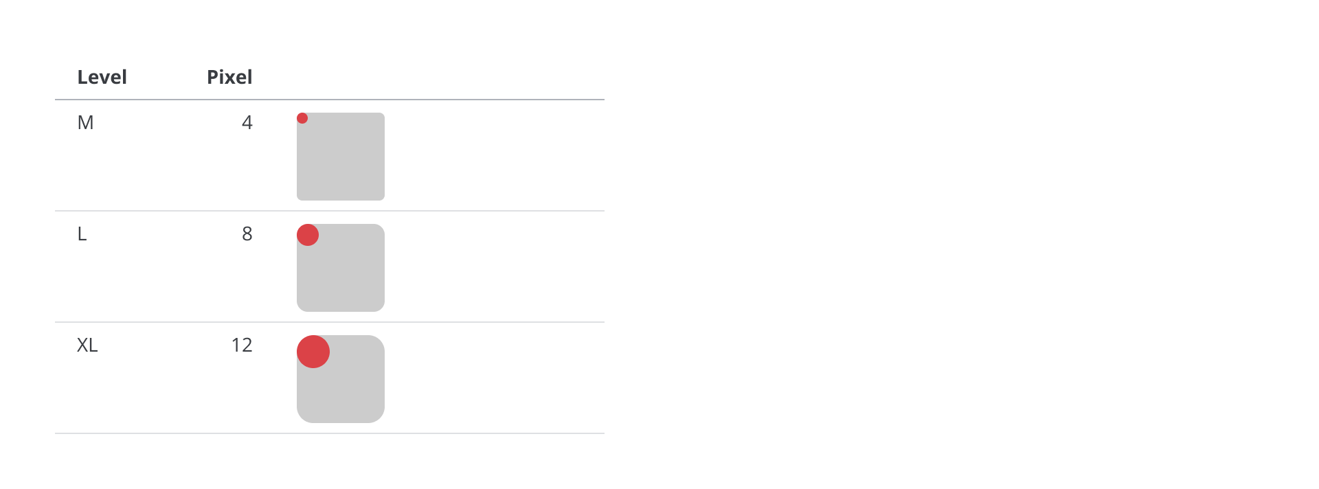
Radius
Sizing scaleから、角丸の半径を決めるのに最適な値を選び、RadiusとしてLevel M, L, XLの名前をつけています。
Sass function
Radiusのサイズを取得できます。
Syntax
get-radius-size($level)
Usage
@use '@inhouse/inhouse-components-web' as inhouse;

.example {
  border-radius: inhouse.get-radius-size($level: m);
}
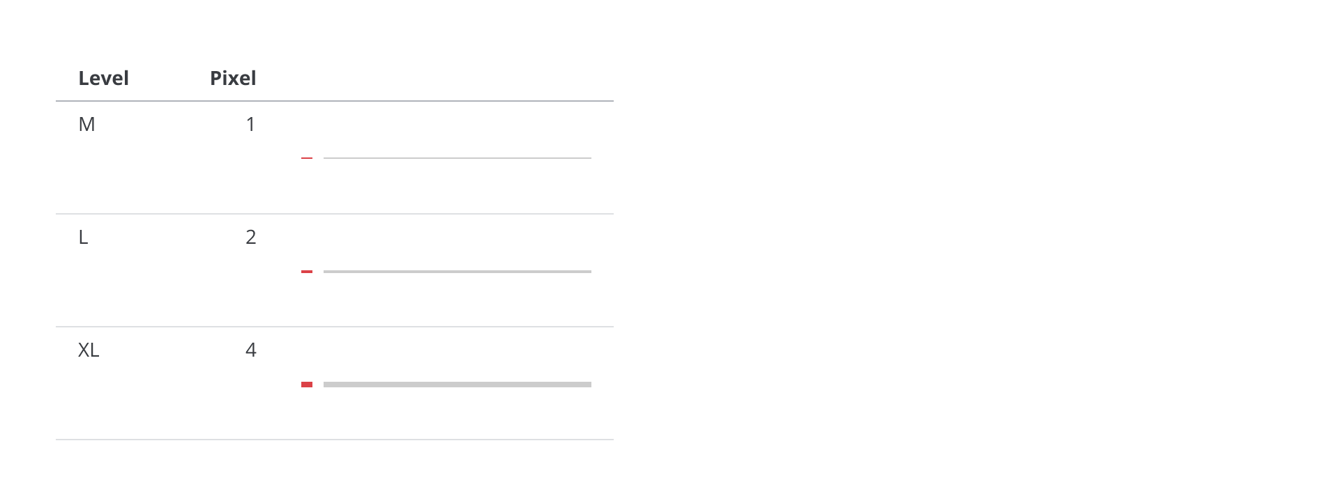
| Level | Pixel(Pepper flavor) | Rem(Pepper flavor) |
|---|---|---|
| m | 4 | 0.25 |
| l | 8 | 0.5 |
| xl | 12 | 0.75 |
Line width
Sizing scaleから、線の太さを決めるのに最適な値を選び、Line widthとしてLevel M, L, XLの名前をつけています。
Sass function
Line widthのサイズを取得できます。
Syntax
get-border-size($level)
Usage
@use '@inhouse/inhouse-components-web' as inhouse;

.example {
  border-width: inhouse.get-border-size($level: m);
}
| Level | Pixel(Pepper flavor) | Rem(Pepper flavor) |
|---|---|---|
| m | 1 | 0.0625 |
| l | 2 | 0.125 |
| xl | 4 | 0.25 |
Content width
ウェブページのコンテンツに最大幅を指定することを想定して、Content widthとしてLevel XSからXLまでの名前をつけています。
なお、これらは画面の横方向に対するサイズの指定のため、Sizing scaleのバリエーションから選んだ値ではありません。また、タイポグラフィではなくデバイスの画面の解像度を根拠とする値なので、Sass functionもRemではなくPixelの単位の値で返します。
Sass function
Content widthのサイズを取得できます。
Syntax
get-content-size($level)
Usage
@use '@inhouse/inhouse-components-web' as inhouse;

.example {
  max-width: inhouse.get-content-size($level: m);
  margin: 0 auto;
}
| Level | Pixel(Pepper flavor) | Rem(Pepper flavor) |
|---|---|---|
| xs | 480px | - |
| s | 640px | - |
| m | 960px | - |
| l | 1200px | - |
| xl | 1440px | - |
Boundary
レスポンシブデザインのレイアウトを変更するブレークポイントを指定することを想定して、BoundaryとしてLevel XXSからXLまでの名前をつけています。
なお、これらは画面の横方向に対するサイズの指定のため、Sizing scaleのバリエーションから選んだ値ではありません。また、タイポグラフィではなくデバイスの画面の解像度を根拠とする値なので、Sass functionもRemではなくPixelの単位の値で返します。
Sass function
Boundaryのサイズを取得できます。
Syntax
get-boundary-size($level)
Usage
@use '@inhouse/inhouse-components-web' as inhouse;

.example {
  @media (min-width: inhouse.get-boundary-size($level: xl)) {
    display: flex;
  }
}
| Level | Pixel(Pepper flavor) | Rem(Pepper flavor) |
|---|---|---|
| xxs | 330px | - |
| xs | 370px | - |
| s | 600px | - |
| m | 800px | - |
| l | 1100px | - |
| xl | 1400px | - |