Button
ボタンは、ユーザーが押すことで機能やアクションを発動するためのインタラクティブな UI 要素です。コンテキストに応じて Navigation(移動)、Confirmation(確認)、Execution(実行)、Cancellation(取消)、UI Operation(UI 操作)の5種類のロールを持ちます。
1. 概要 (Overview)
説明
ボタンは使われ方やそのコンテキストに応じて、次の5種類のロールを持ちます。ボタンを使うときはそのボタンがどのロールを担うのかを意識します。
- Navigation: コンテンツの移動や表示
- Confirmation: ユーザーの意思表示や、内容を確認する画面への遷移
- Execution: データに変更が加わるような機能の実行(保存・登録・削除など)
- Cancellation: キャンセルや状態の解除といった消極的なアクション
- UI Operation: ダイアログを閉じるなど、UI の状態表示のみに変化を与え、データの状態には変更が発生しない操作
リンク
2. 構成要素 (Anatomy)
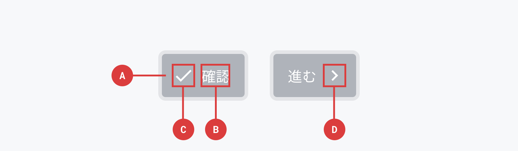
AContainer
ボタンのかたちをつくる要素です。この要素の大きさが、ボタンをタップ/クリックできる範囲です。
必須/任意: 記載なし
BBody
ボタンのインタラクションラベルです。そのボタンを押すことによって発動する機能、またはそのボタンを押すことによって得られる結果や、ボタンを押すことによって発生させたい本来のアクションを示します。インセンティブ/ベネフィットの提示はラベルでは行わず、必要であればボタンの外側で行います。
必須/任意: 記載なし
CLeading, DTrailing
ボタンの縁の要素です。インタラクションラベルの意味を伝わりやすくするために、情報を補完する機能を持ちます。原則的にLeadingにIconを配置しますが、画面の遷移を示す場合や、ページネーションでPrevとNextが対になっている場合など、文脈に応じてTrailingにIconを配置することもできます。
必須/任意: 任意
3. 使い分け (Usage)
いつ使うか
目的となるオブジェクトがあり、そのオブジェクトに対してユーザーが操作を行う場合(Navigation / Confirmation / Execution / Cancellation / UI Operation のいずれか)に使います。
いつ使わないか
操作する対象のオブジェクトが異なるアクションを並べる場合は使いません。
4. バリエーション (Variants)
Appearance
Buttonの見た目を指定できます。
| Modifier class | ||
|---|---|---|
| Flat* | .-appearance-flat | |
| Outlined | .-appearance-outlined | |
| Solid | .-appearance-solid | |
| Transparent | .-appearance-transparent | |
| White | .-appearance-white | |
| Hollow | .-appearance-hollow |
推奨される選び方の判断基準:
- Flat: 基本のボタン。どのロールにも使える。
- Outlined: Primary(Flat / Solid)と組み合わせて Secondary 以下のオプションを提示するときに使う。重要度が低い場合や Cancellation のロールでは単独でも使える。
- Solid: 機能を発動する Execution / Confirmation のロールで使う。Flat と一緒に使わない。
- Transparent: テキストリンクと同等の外観で、サイズとクリッカブル領域は他のボタンと同等の控えめなボタン。Navigation / Cancellation のロールで使う。
- White: Polite トーンのコミュニケーションで、否定的または消極的なボタンとして Solid の代わりに使う。
- Hollow: 写真・イラスト・色面の上に乗せるときに使う。Navigation のロール。
Brightness
Appearanceの中でも背景色が透明なものはBrightness(環境の輝度)を指定できます。指定するとButtonを置く環境の輝度に応じた最適な見た目になります。
| Modifier class | ||
|---|---|---|
| Light* | .-brightness-light | |
| Dark | .-brightness-dark |
Light
Dark
推奨される選び方の判断基準: 記載なし
Color
ボタンの色は、意味に対応してSemantic colorの名前を指定することで配色します。
| Modifier class | Pepper flavor | |
|---|---|---|
| Neutral* | .-color-neutral | Pepper Gray |
| Negative | .-color-negative | Pepper Red |
| Interactive | .-color-interactive | Pepper Blue |
| Favorite | .-color-favorite | Pepper Red |
推奨される選び方の判断基準:
- Neutral: 中立的な配色。クリッカブルであることが判断できる文脈(サイトナビゲーション、パンくず、定型的な操作エリアなど)で使う。
- Negative: 削除など破壊的なアクションに使う。
- Interactive: 基本のカラー。Navigation / Confirmation / Execution のロール全般で使える。
- Favorite: お気に入りなどブランド特有のアクションに使う。
Shape
形状を指定できます。
| Modifier class | ||
|---|---|---|
| Square | .-shape-square | |
| Circle | .-shape-circle |
推奨される選び方の判断基準: 記載なし
Size
どのくらいの大きさで表示するか指定できます。
| Modifier class | ||
|---|---|---|
| XS | .-size-xs | |
| S | .-size-s | |
| M* | .-size-m | |
| L | .-size-l | |
| XL | .-size-xl |
推奨される選び方の判断基準:
- 基本のサイズは M。
- Hollow は写真・イラストの上で使う特性上、XS / S は用意していない。
- Solid は小さくてもボタンと認識できるよう立体感を持たせているため、L / XL は用意していない。
- Transparent は目立たせない用途を想定しているため、L / XL は用意していない。
Width
親要素の幅に対してどのくらいの幅でContainerを表示するかを指定できます。
このModifierは、CardやDialogコンポーネントなど、限られた幅を持つ要素のなかにアクションボタンとしてButtonを配置することを想定して用意されました。HalfやThirdは、ブラウザのウィンドウの幅によっては想定より小さく表示されてしまう場合があります。そこで、まずFullでレイアウトを試してみて、Fullでは表示する領域が広すぎる場合に限り、HalfまたはThirdを選択することをおすすめします。
| Modifier class | ||
|---|---|---|
| Auto* | .-width-auto | |
| Full | .-width-full | |
| Half | .-width-half | |
| Third | .-width-third |
推奨される選び方の判断基準:
- 基本は Auto(ラベルの文字量に合わせた成り行きの幅)。可能であれば 16px の倍数サイズとする。同列に並ぶボタンの大きさを揃えたい場合は固定幅を使う。
- Full は M サイズ以上のボタンで、カラムなどのレイアウト領域に対して 100% にしたいときに使う。
- L サイズのボタンは全幅レイアウトコンテナで 100% にできるが、スクリーンサイズ M 以上では最大でも 50% の幅(Half)になる。
- Inhouse では Auto / Full / Half / Third の4種類を用意している。
Leading
Bodyの前に要素を挿入することができます。Iconが入ったLeadingのみの場合はIconが大きくなります。デバイスサイズに応じて切り替えることができます。
Trailing
Bodyの後に要素を挿入することができます。
実装
Mixin-based
HTML
<button class="button-submit">
  <span class="_body">保存</span>
</button>

<button class="button-favorite">
  <span class="_leading">
    <span class="in-icon" data-icon="heart"></span>
  </span>
  <span class="_body">お気に入り</span>
</button>

<button class="button-nav-next">
  <span class="_body">すべての記事</span>
  <span class="_trailing">
    <span class="in-icon" data-icon="chevron_right"></span>
  </span>
</button>
SCSS
@use '@pepabo-inhouse/components-web' as inhouse;

.button-submit {
  @include inhouse.button-style(
    $options: (
      appearance: flat,
      color: neutral,
      shape: circle,
      size: m,
      width: auto,
    )
  );
}

.button-favorite {
  @include inhouse.button-style(
    $options: (
      appearance: flat,
      color: favorite,
      shape: circle,
    )
  );
}

.button-nav-next {
  @include inhouse.button-style(
    $options: (
      appearance: transparent,
      brightness: light,
      color: interactive,
    )
  );
}
Class-based
HTML
<button class="in-button -appearance-flat -color-neutral -shape-square -size-m -width-auto">
  <span class="_body">保存</span>
</button>

<button class="in-button -appearance-flat -color-favorite -shape-circle">
  <span class="_leading">
    <span class="in-icon" data-icon="heart"></span>
  </span>
  <span class="_body">お気に入り</span>
</button>

<button class="in-button -appearance-transparent -color-interactive">
  <span class="_body">すべての記事</span>
  <span class="_trailing">
    <span class="in-icon" data-icon="chevron_right"></span>
  </span>
</button>
SCSS
@use '@pepabo-inhouse/components-web' as inhouse;

@include inhouse.button-export;
5. ステート (States)
Default
Hover
マウスカーソルを重ねたときの表示。
Focus
キーボード操作などでフォーカスを得たときの表示。
Active
クリック/タップで押下しているときの表示。
Disabled
disabled 属性が設定された無効状態の表示。
6. アクセシビリティ (Accessibility)
このコンポーネント固有のチェック項目です。コントラスト・フォーカス可視化など全コンポーネント共通の原則はアクセシビリティガイドラインを参照してください。
<div>や<span>ではなく、用途に応じて<button>要素または<a>要素でマークアップする- アイコンのみで構成されるボタンには、
aria-labelでボタンの機能を伝えるテキストを設定する - ホバー / フォーカス / 押下(active)の各ステートが視覚的に区別できる
- フォーカスリングを消したり、アウトラインを 0 幅にしたりしない
7. ライティング (Writing)
- ラベルは、ボタンを押すことで発動させたい機能・アクションを示す
- ユーザー視点の行為を表す動詞を用いる。慣用的なラベル(保存、削除、ログインなど)はそのまま採用する
- 熟語+「する」となるラベルでは「する」を省く(例: 「ログインする」→「ログイン」、「確認する」→「確認」)
- UI 操作自体に自己言及するラベルを使わない(例: ボタンに「押す」、ダイアログを閉じるボタンに「閉じる」、選択 UI に「選択する」)
- インセンティブやベネフィットの提示はラベルでは行わず、ボタンの外側で行う(例: ラベルを「無料新規登録」ではなく「新規登録」とし、無料であることはボタンの外で伝える)
- ラベルを2行にしない(短く、明確に)
- 即時に処理が完了せず追加入力や手続きが必要な Execution ボタンでは、ラベル末尾にエリプシス(…)を付ける。ただし CTA や主要ゴールへのクリティカルパス上のボタンには付けない